Task: Redesigning a preloader for the Meisterplan homepage
When you sign up for a test version of the Meisterplan PPM software, you have to wait several seconds until your access is set up.
Meisterplans requirements
- bridge a waiting time of 6-12 seconds
- assure the user that waiting time is normal and system has not crashed
- correspond with the Meisterplan CI
- entertain
Additional requirements I set up for the task
- should not extend loading time
- infinite loop which can be terminated at any time, but does not seem too much like one
- explain why waiting is neccessary
- make a connection to the product and its functionalities
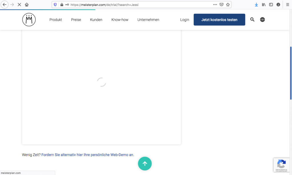
The current situation looks like this:

Disadvantages
- classic spinners wake bad memories of long waiting times
- no relation to the brand or product
- not fun or entertaining
„Pack a package including the most important functions of Meisterplan.“
My Idea
VERSION A
„Package“ alternating with smaller sqares to make a connection to the waiting time.
VERSION B
Transformation from the logo to the „package“.


