BACKGROUND
Practical application of the Udemy course „The Ultimate Guide to Usability and UX“ by David Travis with the goal of showing the full user-centered design process for a project of my choice.
PROCESS CHART
The approach is oriented on the human-centred design process as defined in ISO 9241.
MY TASK
„Help users remember and organize their to-dos and feel productive.“
RESEARCH
I interviewed and observed 8 users performing taks related to the topic, then I sorted the findings in groups by their main characteristics and turned those into personas.
PERSONAS
My next step was to rate those personas and define a primary persona. I choose Daniel because he’ll need the most advanced options and his solution will be usable for my other personas as well.
RED ROUTES & USER STORIES
I went on defining the most important red routes for my personas and phrasing them as user stories. To be really sure what to focus on first, I rated the red routes of all users by importance.
TEST SCENARIOS
„You are a busy person who tends to forget to-dos sometimes. Now you got this new app that is supposed to help you.
You need to mow the lawn today. You want to make sure you don‘t forget it because it will rain tomorrow.“
„You would like to organize all your garden tasks in one place.“
„Now you‘re done mowing the lawn. You would like to get that off the list.“
„You are a selfemployed person and you would like to use the new app you have for your time tracking as well.
Research is part of Phase 1 of your Project X. You would like to work on it today and record the time it takes you.“
„Now you want to see all the times you recorded on Project X.“
PAPER PROTOTYPE
FORMATIVE USABILITY TEST I – PAPER PROTOTYPE
USABILITY PROBLEMS RATED
- Naming: projects vs. categories, couldn’t sort task (critical)
- Save-button not used, discarded changes (critical)
- Moving tasks into an opened list from that list (medium)
- Visibility of fields to enter time by keyboard (low)
- Naming: Upload Badge & Stop / Done (low)
- Telling the difference between deadline and reminder (low)
- Expecting different actions on swipe and long press (low)
USABILITY TEST II – INVISION PROTOTYPE
USABILITY PROBLEMS RATED
- Sorting a project into a list is still difficult for all, the names ”project” and ”label” are not what they are looking for, some look for ”category”, no one finds the function right in the task’s popup menu (critical)
- Many tried clicking “add subtask“ when asked to create a parent category/list (critical)
- Time recording couldn’t be found easily, most expected to see a watch symbol, one searched in statistics and most said the current icon looks like something else, like voice recording for example (critical)
- The recording indicator on the home screen was not found by all users right away, could be more visible than a simple notification symbol (serious)
- 2 out of 5 did not know how to mark a task as done, they looked for delete instead (serious)
- Most expect different actions on clicking the task bar and the three dots (medium)
- Greyed out text is hardly visible in the sun (medium)
- The taks bar also wasn’t easiliy recongized as clickable at all (medium)
- Naming of greyed out functions like “no date” confused some (medium)
- In some cases clicking areas where too small (medium)
- Some thought about going to the task first to see its recorded times (medium)
OTHER FINDINGS
- No one was interested in setting amount and priority
- Most were interested in setting colors for lists
- Most were not really insterested in day list, week list and „maybe someday“ list, did not know the „Getting Things Done“ Methodology
LEARNINGS
- Even seemingly easy tasks can take users a while to accomplish and those may not even be the least tech-savvy or those who generally take longer
- If there are many options and ways to get to the target, it is hard (and expansive) to built an electronic prototype, you have to focus on some in order to keep it simple
DESIGN DIRECTIONS
Exploring various design possibilities and choosing one to refine and built a high fidelity prototype.
App & Web App in light mode
App & Web App in dark mode
DESIGN SYSTEM / STYLEGUIDE
overview of some of the most important definitions and UI-elements
USER FLOWS / RED ROUTES
most important tasks users want to achieve with the interactive system, screen by screen
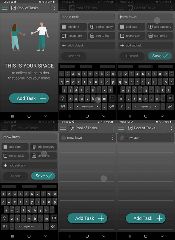
Add a task
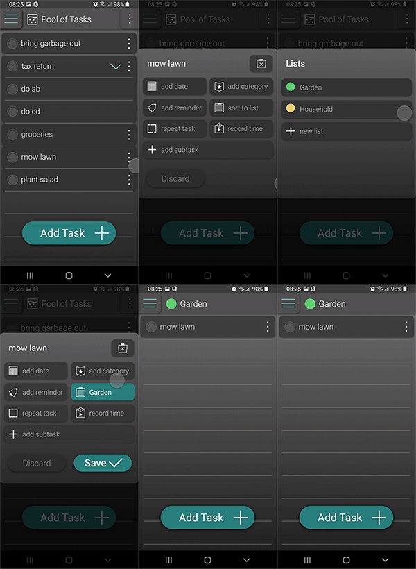
Sort a task to a list
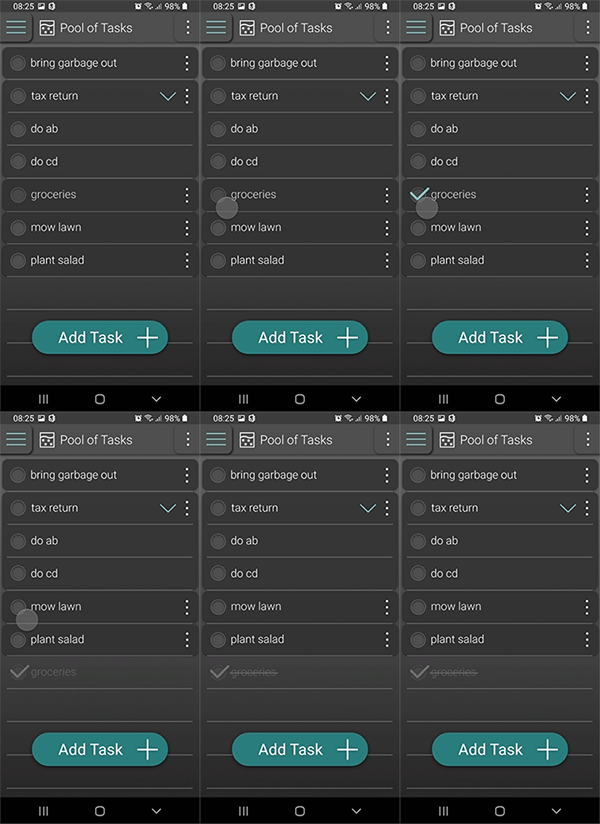
Mark a task as done
Add a due date / deadline to a task


